Ice dyeing…Developing Your Color Palette
To kick off my release of my newest deflected doubleweave draft, I taught ice dyeing yarn to weavers in the group a month prior to the actual weaving workshop. There are many ice dyeing techniques and approaches for dyeing fabric, but yarn seemed to be an area that needed further exploration. My first experience ice dyeing fabric occurred in 2016 at the Fort Wayne Museum of Art. My silk was scrunched and I can’t even recollect the color palette I used, but I remember using about 5 dye powders. Although I don’t recollect the colors, I loved “trusting the muck” and rinsing out this silk scarf.
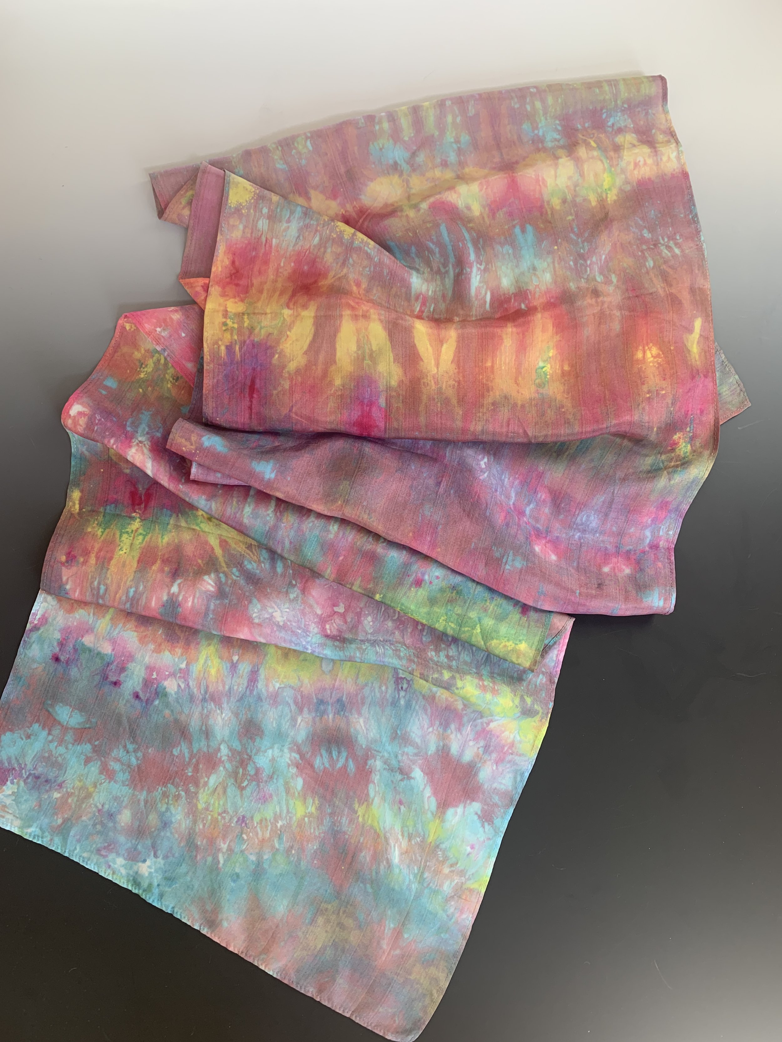
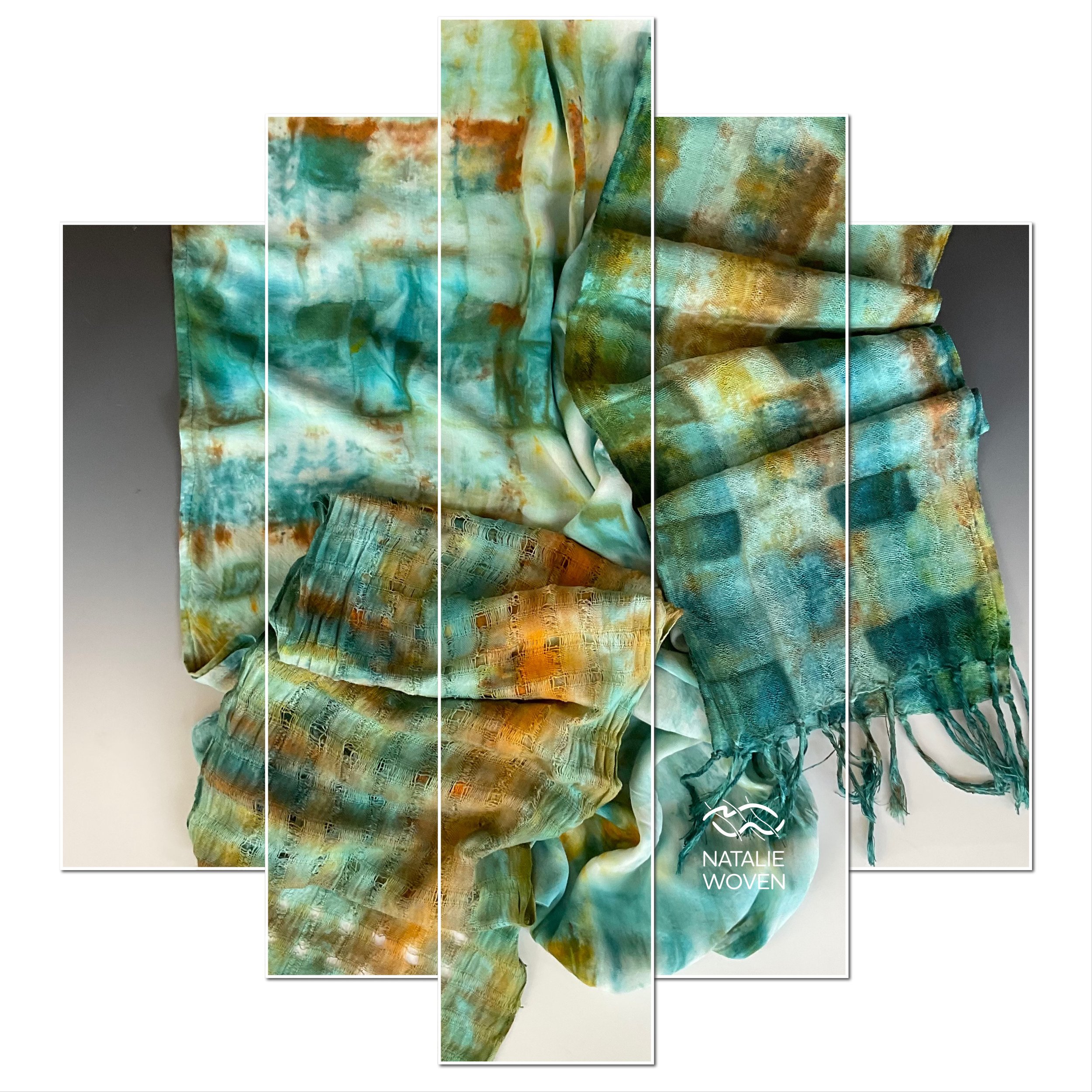
Today I do a much better job of recording my color palettes and test them out on cheesecloth, old bedsheets, fabric scraps and whatever plant-based materials I can find! A palette is defined as a group of colors an artist might use. Tencels behave differently than cotton when absorbing the dye - it’s demonstrated on fabric and also on cotton at least with controls I have in place. Frequently I will weave with a high sheen Tencel next to a yarn with a low sheen and the value differences are important to me also. The ice dye results are somewhat effected by the weave structure of the fabric. My current test palette consisted of Kingfisher Blue, Herbaceous, Bronze, and Avocado. Plain weave scarf blanks of tencel and cotton were used with the one cotton having a spaced and crammed section in the warp (vertical lines) and the other having it in the warp and the weft (squares). All three scarves used Dye Under Ice or DUI and were prefolded after Synthropol soak and rinse. The flow of dye through the folds of fabric in the muck were shown to my most recent zoom class. Although I could experiment a bit more with exact dye ratios to soda ash for the purposes of creating value differences, I prefer to work with the serendipity nature of the ice dyes and spilts in the hues and subsequent values that occur in small batches. A previous guild dyeing workshop during the pandemic was fun to learn about these ratios to create a gradient within the hue with Instructor and Member, Sara Nordling. Our prep and process at that time did not include ice dye methods, but I’m certain it would work.
I tend to use analogous colors when I weave and dye and have shown participants my latest lapel pin color wheel. I’ve also learned that 3-4 colors in a dye tub are optimal in terms of creating less mud. I knew right away when I pulled from the tub that I had created a palette I could work with and the next step was to create on yarn.
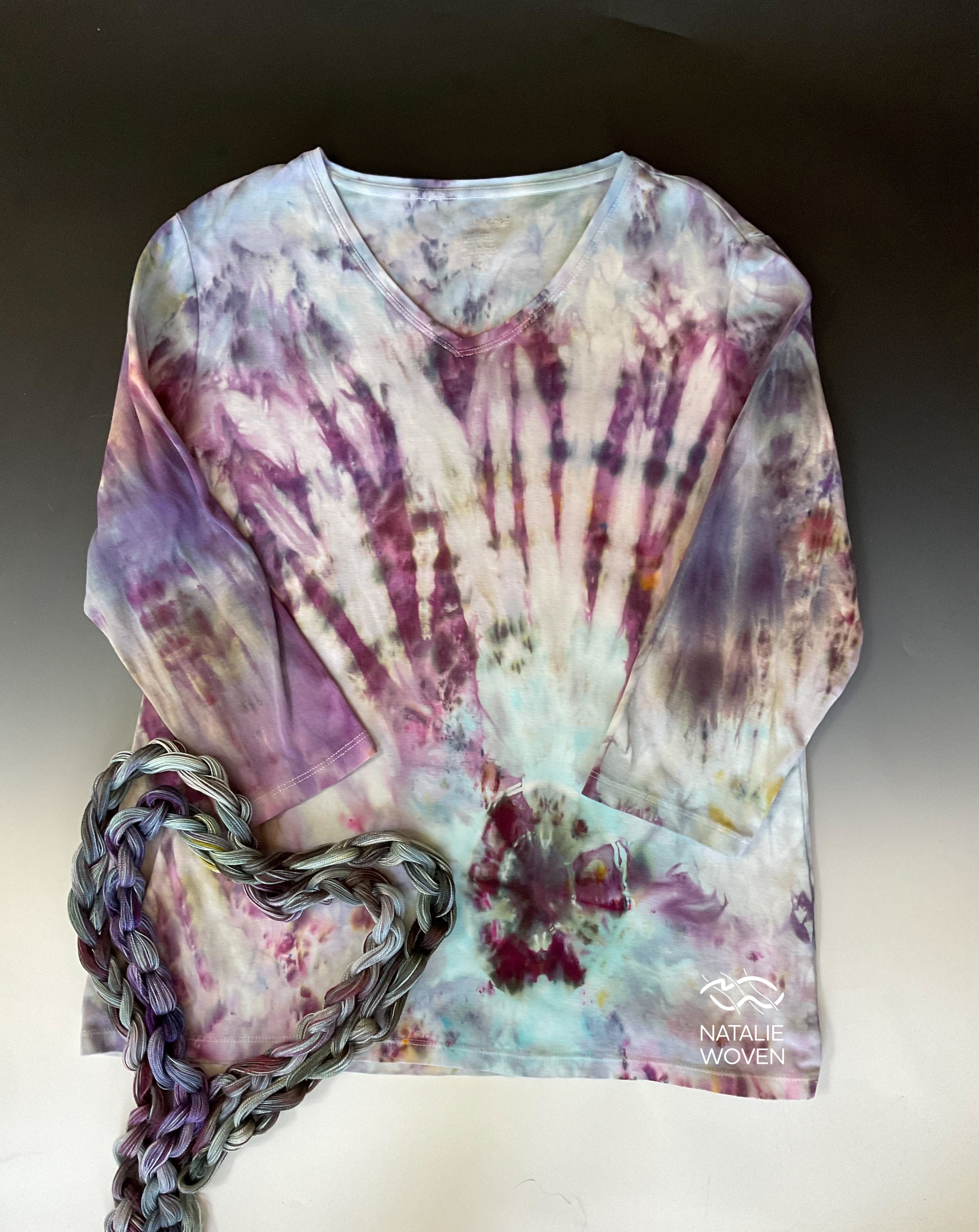
My set-up…so I experimented with gravity dyeing DUI with wet and dry Tencel. I purchased a corner shelf rack and snaked my warps through the rack. A PVC pipe was used to put a little tension on the yarn. The wet one got a little tangled. I sprinkled my dye soda ash over the top of the yarn. This time my palette was a little different as I was working on a different color palette: Timberwolf, Black Cherry, Robin Egg, Wedgewood and Nightshade. I made some boat-shaped cardboard containers and placed over the rack over a deep tub before I added my ice - which melted too quickly. Some of the ice fell through open areas in the rack too, so I ended up resorting to DOI and letting melt for 24 hours. It turns out I absolutely loved it and decided to muck dye DOI the same color palette for a different repeat. Love the color split on cotton shirt.
Next gravity DUI continued - both dry. This time I used a screen to keep my ice from falling through the rack and no PVC anchor. One batch was kingfisher blue palette and the other the black cherry palette.
Color Palette:
Gravity DUI dry and wet: Black Cherry, Robin Egg, Wedgewood, Timberwolf, Nightshade
Back to weaving and color palettes…in further building color palettes of yarn, I will strive for light, medium, and dark values in my deflected doubleweave weaving. I will classify an ice dyed warp or a painted warp as overall dark, medium, or light relative to the other yarns I’m considering. I always build warps in palettes first. If the same values or hues occur line up together among the different warplets , I know I’ll have to have more weft choices to add depth of color, but most importantly design distinction. In workshops, coming up with your wefts is the next step after building project warps of 3-5 dyed warps. Activity #1 Value Study-before sampling, take 5 possible weft yarns and line them up from light to dark without paying attention attention to hue. Activity #2 Hue Study -take 5 hues (colors) that might work well with your warp and place them together in order of the spectrum ROYGBIV. You don’t need to sample all the colors of your weft palette, but there might be times when you need a dark or light value in an analogous color for weaving! Gradients are design elements made up of colors that gradually fade into one another. They exist from multiple shades of the same color or from colors that blend into one another. Both are important for weaving with multiple ice dyed warps.


